LinkedIn cover photo ideas: 10 ways to stand out and build your personal brand

Adobe Express
03/24/2026
Your LinkedIn profile does a lot of heavy lifting: headline, experience, recommendations, and skills all work together to tell your professional story. But there’s one element many people overlook — the LinkedIn cover photo.
That banner is the first large visual people see when they land on your profile. Used well, it can instantly communicate your interests, expertise, and personal brand. Used poorly — or left generic — it’s a missed opportunity.
Most users never customize their cover image, which gives you a simple advantage. With the right LinkedIn cover photo, you can stand out in a crowded feed, make your profile more memorable, and encourage recruiters, clients, and collaborators to stick around longer.
In this guide, you’ll find 10 customizable LinkedIn cover photo ideas, plus practical tips on how to choose and design one that fits your goals — no design experience required.

Key takeaways
- Your LinkedIn cover photo is a prime space for personal branding.
- A strong banner helps communicate your role, values, or interests at a glance.
- Keep key elements away from the bottom-left corner, where your profile photo overlaps.
- Simple, focused designs outperform cluttered visuals.
- Templates make it easy to create a professional-looking cover in minutes.
Summary/Overview
Before you start: A quick design tip
1. Highlight your passions
2. Showcase your cause
3. Use your location strategically
4. Sum up your skills in one visual
5. Belong to your field
6. Assert your taste
7. Keep it simple and focused
8. Match your brand across platforms
9. Use templates to save time
10. Update your cover as your career evolves
How to create your LinkedIn cover photo with Adobe Express
FAQs
Before you start: A quick design tip
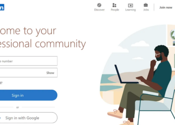
Remember that LinkedIn places your profile photo over the bottom-left corner of your cover image. Keep important text, logos, and focal points centered or toward the right side so nothing gets cropped or hidden.
1. Highlight your passions
You’re more than a list of job titles. Recruiters and potential collaborators often look for personality, culture fit, and shared interests — not just skills.
Use your cover photo to highlight what you care about:
- Your side projects
- Your creative interests
- Communities you’re part of
- Your company or personal brand, especially if you’re a founder
This approach makes your profile more human — and more memorable. When people compare multiple profiles, the one that shows personality is often the one they remember.
If you include social handles or interests, use a clean, readable font and keep the layout simple so both your photo and your message can stand out.
2. Showcase your cause
If your work is connected to a mission — whether that’s sustainability, education, accessibility, or another cause — your cover photo is a great place to reflect that.
Featuring a cause you care about:
- Signals your values
- Attracts like-minded connections
- Helps people immediately understand what motivates you
This works well for professionals in nonprofits, social impact, education, policy, and purpose-driven businesses.
3. Use your location strategically
Location still matters — especially for recruiters and clients searching by region.
You can:
- Feature your city skyline
- Highlight the area where you work or want to work
- Show the regions your business serves
For business owners, this can reduce friction for potential clients. For job seekers, it signals commitment to a specific market and helps recruiters quickly see your geographic focus.
4. Sum up your skills in one visual
A cover photo can do more than look nice — it can communicate your value.
Try distilling your strengths into:
- A short list of core skills
- A simple visual framework (like a Venn diagram or icons)
- A concise headline that describes what you do best
For example: Are you strategic and creative? Technical and empathetic? Analytical and collaborative? Visualizing this makes it easier for visitors to understand your profile before they even scroll.
5. Belong to your field
Your header image can instantly position you within your industry — whether that’s tech, finance, design, science, marketing, or the arts.
Using relevant imagery, icons, or visual themes helps:
- Establish credibility
- Signal expertise
- Reduce guesswork for recruiters and peers
You don’t need a lot of text. A clean, well-chosen visual can communicate your field just as effectively.
6. Assert your taste
Safe choices — like generic office desks or landscapes — are common on LinkedIn. They’re fine, but they’re also forgettable.
Consider:
- A bold color gradient
- A textured background
- A creative portrait crop
- A visual that complements your profile photo
Your cover photo should feel intentional and aligned with your personal brand. A strong aesthetic choice can make your profile feel more modern, confident, and distinctive.
7. Keep it simple and focused
Your cover photo isn’t a resume. It’s a visual headline.
Avoid:
- Too much text
- Too many ideas in one image
- Competing focal points
Aim for one clear message or theme. Simplicity improves readability — especially on smaller screens.
8. Match your brand across platforms
If you’re building a personal or business brand, consistency matters. Aim to align your LinkedIn cover with:
- Your website
- Your portfolio
- Your other social profiles
- Your brand colors and fonts
This builds recognition and makes your online presence feel cohesive and professional.
9. Use templates to save time
Designing from scratch can be time-consuming. Templates give you a strong starting point with:
- Correct dimensions for LinkedIn
- Balanced layouts
- Readable typography
- Modern design styles
With tools like Adobe Express, you can customize colors, text, images, and layouts in just a few clicks — then export a high-resolution cover image that’s ready to upload.
10. Update your cover as your career evolves
Your LinkedIn profile isn’t static — and your cover photo shouldn’t be either.
Consider updating it when:
- You change roles or industries
- You launch a new business or project
- Your goals or focus shift
- You want to refresh your personal brand
Small updates can keep your profile feeling current and intentional.
How to create your LinkedIn cover photo with Adobe Express
Creating a professional LinkedIn cover photo doesn’t require design experience. With Adobe Express, you can:
- Start from a professionally designed template
- Customize colors, fonts, and images
- Resize automatically for LinkedIn
- Export a high-quality JPG or PNG in seconds
Once uploaded, your new cover photo becomes the visual anchor of your profile — and often the first thing visitors notice.
FAQs
What size should a LinkedIn cover photo be?
The recommended size of a LinkedIn cover photo is 1584 × 396 pixels. Using the correct dimensions prevents cropping and ensures your image looks sharp on both desktop and mobile.
Should I include text on my LinkedIn cover photo?
Yes, but keep it minimal. A short headline, role description, or value statement works better than long paragraphs.
What should I avoid in a LinkedIn cover photo?
Avoid cluttered layouts, tiny text, low-resolution images, and placing important elements in the bottom-left corner where your profile photo overlaps.
How often should I update my LinkedIn cover image?
Update your LinkedIn cover image whenever your role, focus, or personal brand changes — or when you want to refresh your profile’s look.
Can I use the same cover image across platforms?
You can, but it’s better to resize and adapt designs for each platform’s dimensions to avoid awkward cropping or misalignment.